Visualizations
Data becomes more interesting when you can explore it.
Interactive visual experiments built from public data, curiosity, and the patterns hiding inside everyday life.
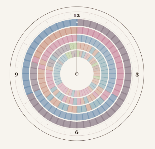
American Time Use Survey · 2025
Where the Hours Go
A week in American life, told hour by hour through an interactive radial view of work, sleep, care, leisure, travel, and everything in between.
Explore visualization →